| Analytics , SAP Analytics Cloud ,

Businesses often work with large number of data points to perform analysis and take important decisions. Collecting billions of data points and analyzing a sample of it through graphical representations can be difficult and at times misleading as well. The most common approach to solve this problem is to use a measure of variability using error bars. Error bars are graphical representations of the variability of data and used on graphs to indicate the error or uncertainty in a reported measurement.In this blog, we will see how to create an error bar in SAP Analytics Cloud (SAC).
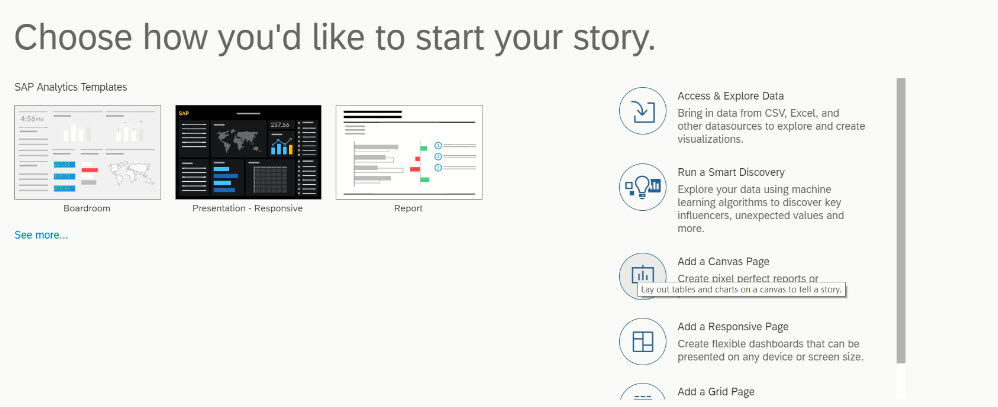
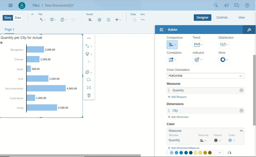
Go to SAP Analytics cloud in the browser and click on create story.
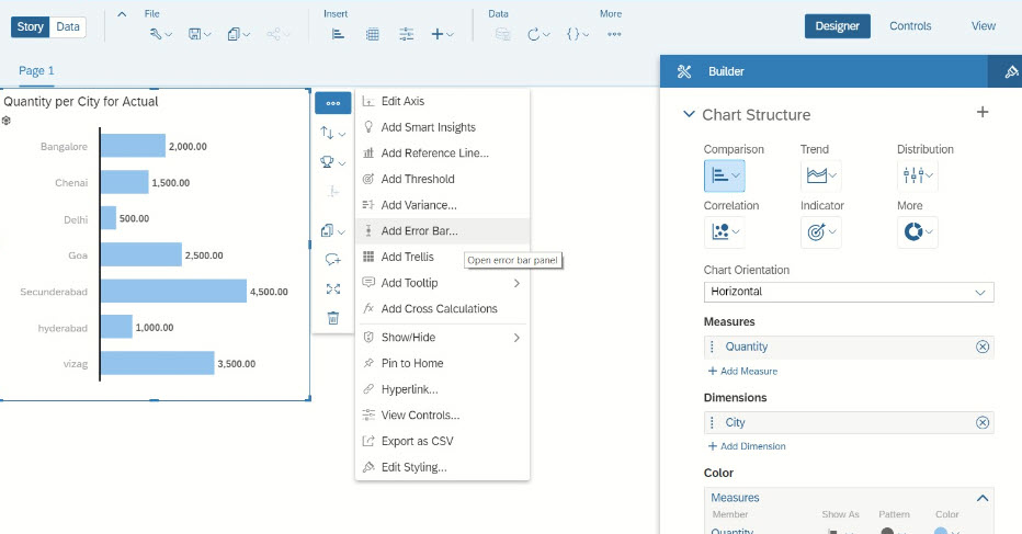
There will be two types of error bars.
Fixed type Error Bar:
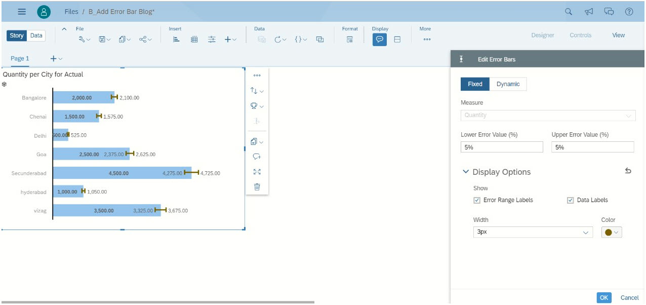
This type allows static values only. A menu will be displayed on the right to Create Error Bars. In this section, it allows us to create error bars based on the percentage values and accepts only fixed values. For this example, ±5% is used for quantity. Define lower error value as -5 and upper error value as +5 as shown below.
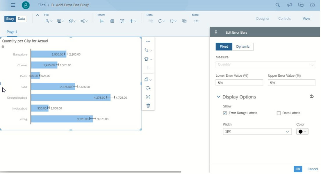
In the properties sheet, by default the “Error Range Labels” will be selected, if needed it can be toggled.
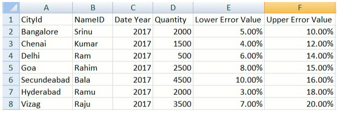
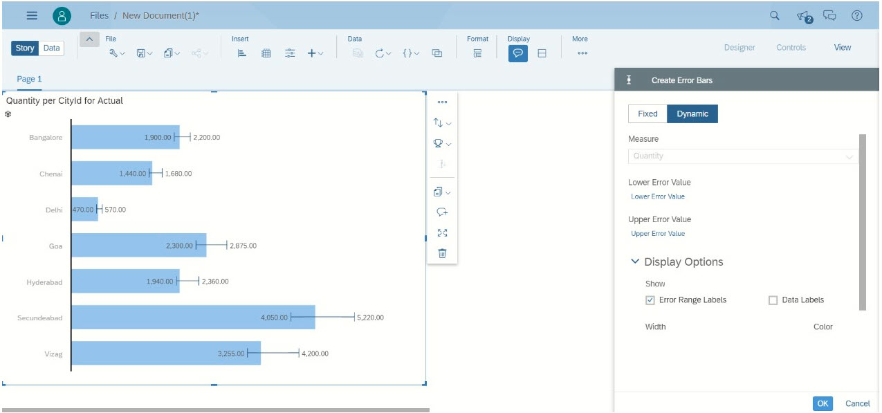
Dynamic type Error Bar:
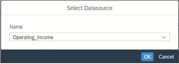
This type allows dynamic values only. In this example, there are two more measures added to the data source denoting the low and high value of the error. Below is the screen shot of the data source.
In the dynamic type property sheet select the measures for the respective error values.
In the screen shot below for each city there are different error ranges.
There will be other options
Below is the screen shot with all the options enabled.