by Rajitha Madineni | Analytics , Looker ,
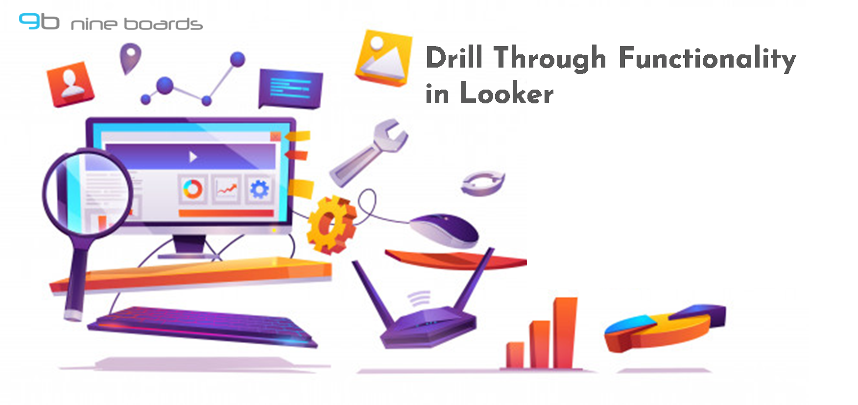
Adding drill through feature to your visualizations enable users to look into different layers of data granularity and analyse hierarchical data. In this blog we have explained how you can apply drill through functionality in Looker. Step 1: Login to Looker web and select the data under Explore menu bar. Step 2: Once you select […]
by Rajitha Madineni | Analytics , Looker ,
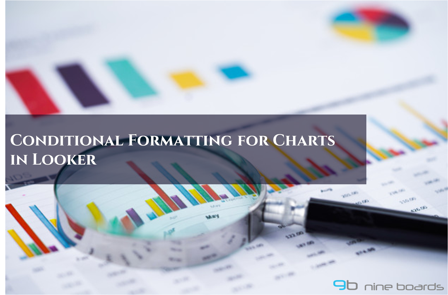
It is important to draw attention to data points that causes critical changes to your data. This is when the Conditional Formatting feature comes handy. Conditional formatting for charts is very useful to gain insights about the performance of your data. In this blog, we will walk you through the steps for creating a chart […]
by Rajitha Madineni | Analytics , Looker ,
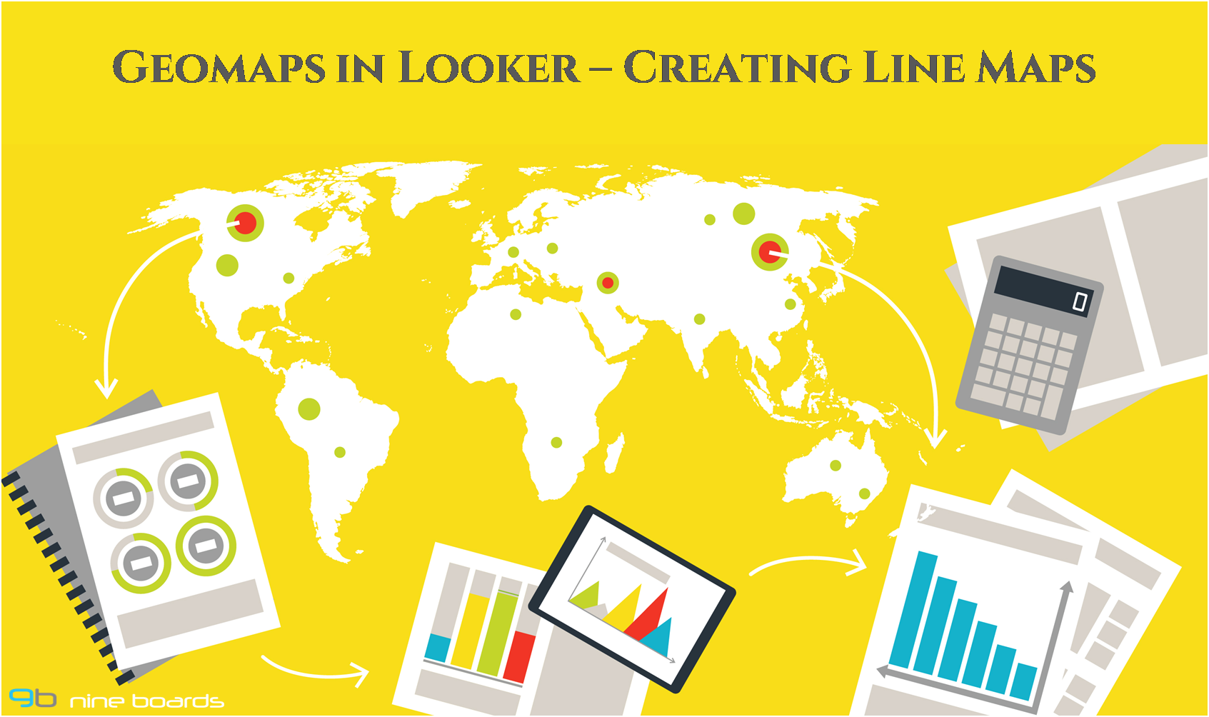
There are scenarios where businesses want to analyse the”where” and “why” of their data. There is no better way to perform this analysis than using a GeoMap. Looker has got you covered to perform all kinds of geographic data analysis with your data. In this blog we are going to see how you can add […]
by Rajitha Madineni | Analytics , SAP Analytics Cloud ,
Businesses often work with large number of data points to perform analysis and take important decisions. Collecting billions of data points and analyzing a sample of it through graphical representations can be difficult and at times misleading as well. The most common approach to solve this problem is to use a measure of variability using […]
by Rajitha Madineni | Analytics , SAP Analytics Cloud ,
Charts are one of the most commonly used visualizations in dashboards and reports. With time being an important factor, it would be much easier for decision makers to comprehend, analyse and gain insights, if the chart visualizations used in the dashboard had some kind of visual highlights. This is where conditional formatting comes into play. […]