| Analytics , SAP , SAP Analytics Cloud ,

Tables are an effective way of displaying data. Highlighting important values or providing visual cues in a table enables user engagement and helps make faster decisions. This is where conditional formatting comes into play. Conditional formatting uses thresholds to provide visual cues of your information, so that you can quickly see which areas are doing well, and which areas may need improvements. When you apply conditional formatting in SAP Analytics Cloud,
In this blog, we are going to see how to add conditional formatting to a Table in SAP analytics Cloud (SAC)
1.Goto SAP Analytics cloud in the browser and click on create story.
2.Click on the “Add a Canvas Page”.

3.Add a data source (Model) and click OK.


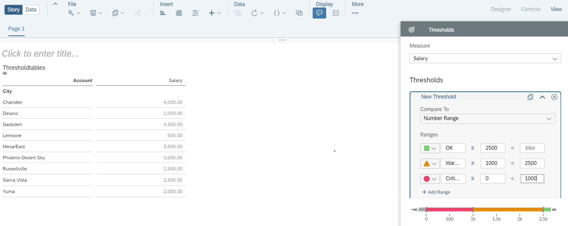
4. Now add a table and select required dimensions and measures (in this example City and Salary are chosen)

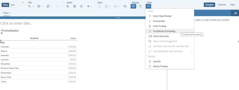
5.Now click on “More” and select “Conditional Formatting”.
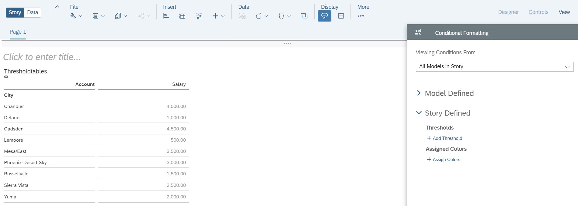
6.Now choose a measure that needs formatting (Salary is chosen here).
7.Choose a comparative measure listed in the drop down.
There will be two options.
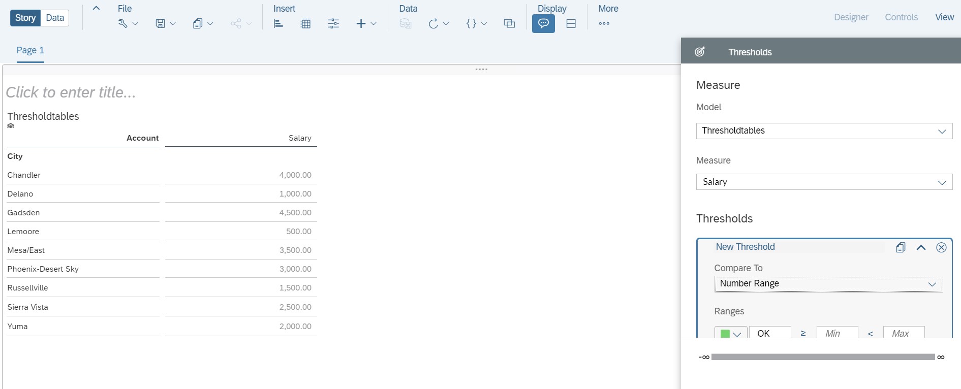
In this example Number Range is selected.

As we type our values for the upper and lower, we consider giving values which are certain.
For example, A lower boundary cannot be larger than the upper.

9.To add another range, select Add Range.
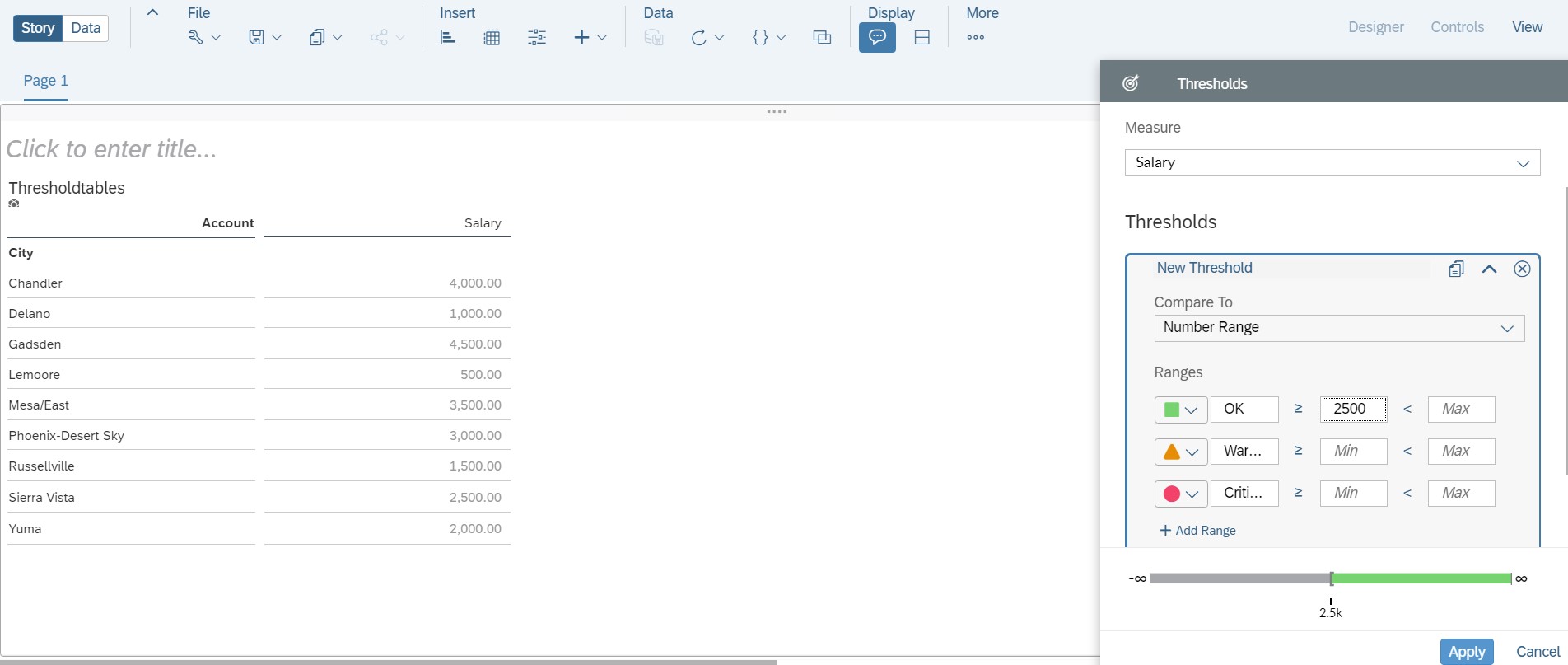
There is an option at the bottom (next to “Add Range” option) to filter out data if needed.
10.When finished with the adding thresholds, click Apply.
11.Select DONE
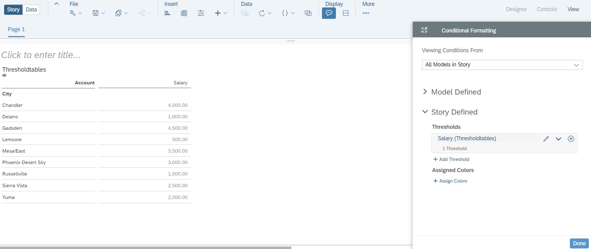
12.When we click on “Done”, the formatting will not be applied to the table. There is one more step to be done to apply the formatting.
Click on the Column, goto Thresholds àclick on ” Show thresholds ”
(Formatting has been applied)
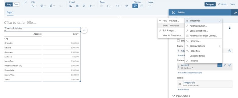


Now that the conditional formatting for the table is done, we can easily focus on the high and low data points.