| Analytics , Power BI ,

Color themes are one of the most important aspects of a dashboard/report. Colors help setting a context, correlate information and draw attention to key indicators. When a dashboard / report uses colors from a business’ logo or brand, it evokes an instant emotional connection to its data stories. Power BI comes with a variety of in-built color themes that you can use as-is or tweak as needed. In this blog, we are going see how we can create our own color theme by importing a JSON file into Power BI desktop.
To create your own color theme, follow the steps below:
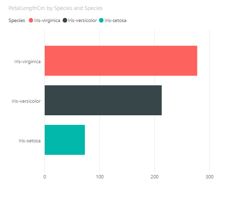
Step 1 : Open PowerBI Desktop and create a Bar Chart as shown below. In this example, we have used a sample data for the visualization.
Step 2 : Now open an editor Like Notepad or Notepad++ and copy – paste the code written below.
{

"name": "BarTemplate",

"visualStyles": {

"barChart": {

"*": {

"general": [{

"responsive": true

}],

"legend": [{

"show": true,

"position": "Top",

"showTitle": true,

"titleText": "",

"labelColor": { "solid": { "color": "#01B8AA"}},

"fontFamily": "Courier New",

"fontSize": 10

}],

"valueAxis": [{

"show": true,

"axisScale": "Linear",

"labelColor": { "solid": { "color": "#333"}},

"fontSize": 14,

"fontFamily": "Courier New",

"labelDisplayUnits": "0",

"labelPrecision": "Auto",

"showAxisTitle": true,

"axisStyle": "showTitleOnly",

"titleColor": { "solid": { "color": "333"}},

"titleText": "asdf",

"titleFontSize": 12,

"titleFontFamily": "Courier New",

"gridlineShow": true,

"gridlineColor": { "solid": { "color": "#eee"}},

"gridlineThickness": 2,

"gridlineStyle": "dashed"

}],

"dataColors": ["#D16349", "#CCB400", "#8CADAE", "#8C7B70", "#8FB08C", "#D19049", "#D1A649", "#81CC00", "#8C9DAE", "#8C8870", "#8CB09A", "#CFD149"],

"labels": [{

"show": true,

"color": { "solid": { "color": "#fff"}},

"labelDisplayUnits": "0",

"fontSize": 11,

"fontFamily": "Courier New",

"enableBackground": true,

"backgroundTransparency": 30

}],

"plotArea": [{

"transparency": 20

}]

}}}}
The above JSON file has the following parameters:
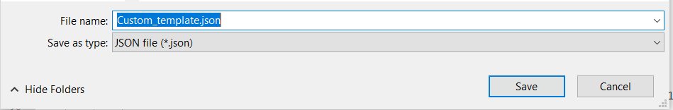
Save the notepad file as “TemplateName.json” as shown below.
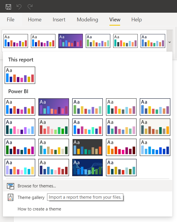
Step 3 : Open Power BI Desktop and goto Menu Ribbon>View >Themes and select “Browse for Themes”
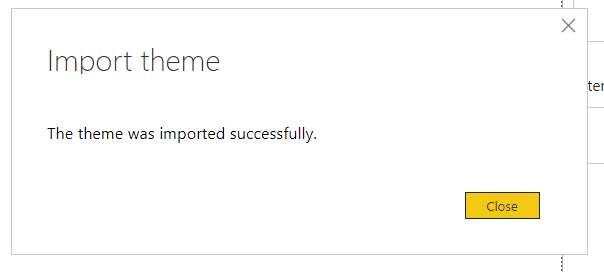
Step 4 : A pop-up screen will open up and you can select and upload the custom theme JSON file you had saved.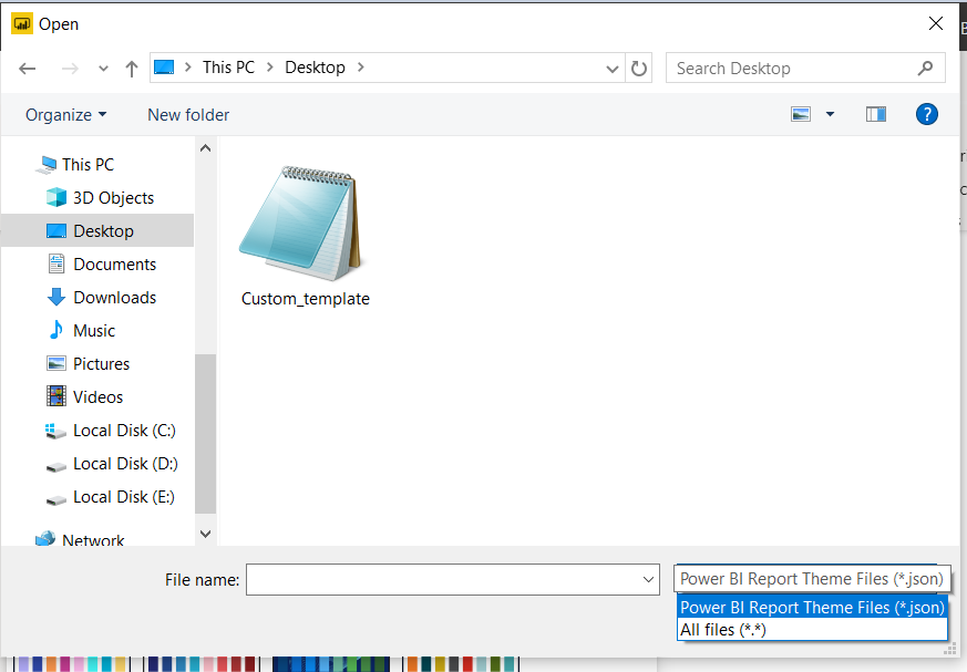
Step 5 : The uploaded theme will be applied to the bar chart as shown below.
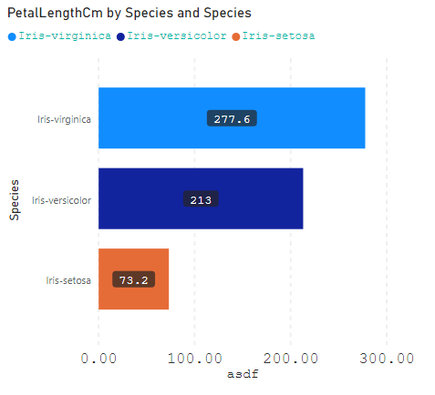
When you apply a custom color theme to any visualization, the colors will automatically default to the ones mentioned in the JSON file. When you try to manually change the colors of that particular visualization, it will pop up the color options specified in the JSON file. The imported color theme can be reused across all the visualizations in a dashboard.