| Analytics , Data Analytics , SAP Analytics Cloud ,

Linked analysis is an useful feature that allows you to dynamically interact with data. When you filter or drill down data in one chart within your story, you can trigger actions in the other related charts or tables. In this blog, I have explained the step by step procedure as to how you can create Linked Analysis in SAC.
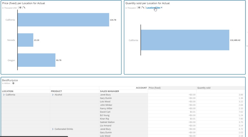
In the following example, I have used multiple components based on a single data set. There are two charts – one showing “Fixed Price per Location”, the other showing the “Quantity Sold per Location” and the table shows all the data from the data source. I have mapped 3 locations in Chart-1 which can be filtered or drilled through. Interacting with Chart 1 will filter the data in the rest of the components accordingly.
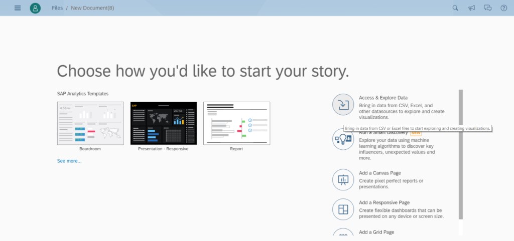
Navigate to SAP Analytics cloud in the browser and click on create story.
1. Click on “Add a Canvas Page”.
2. Click on Chart.
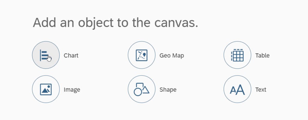
3. Add a data source (Model) and click OK.

4. For this example, the story is built as shown below.

5. By default, the linked analysis will not be functional. (Try to filter data in one of the charts, it filters only that chart).
In the below screen shot California is filtered on the chart but other chart and the table are showing all the data.
6. For enabling linking, select a chart and click on the icon highlighted below.

7. There will be Linked analysis property sheet on the right.

8. Select a chart interaction option:
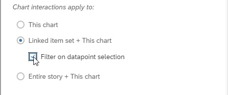
This chart (default option): Filtering and drilling through hierarchical data on this chart will only update this chart.
Linked chart set: Filtering and drilling through hierarchical data on this chart will update all the charts in the set based on the same model or with linked dimensions to this chart’s model. Use the filter on data point selection option to filter other charts on a selected data point.
Entire Story: Filtering and drilling through hierarchical data on this chart will update all the charts in the story based on the same model or with linked dimensions to this chart’s model.
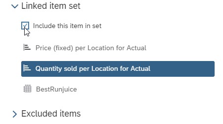
9. Define your linked chart set by excluding charts. By default, all the charts in story are included in the linked chart set.
To exclude a chart, select the chart and deselect the option Include this chart in set. The excluded charts will be moved from the Linked chart set area to the Excluded charts area.
10. The Link has been created between the charts and table. Now the interaction between them is possible. Filtering and drilling through hierarchical data on this chart will simultaneously update other charts depending on the chart interactions option you selected (Now try filtering on the chart which is set in the “Linked Analysis”, the filter will be applied on the charts and table included).
Below is the screen shot of the analysis for California in all the components.

Linked analysis is useful when you want to see how one KPI affects the other related KPIs. Drilling down in a chart allows you to pack a lot of information into a small portion of your story. This way there will not be too much data at once.
By default, chart interactions apply only to the chart you select. However, you can also apply linked analysis to all the charts in a linked chart set or to the entire story.